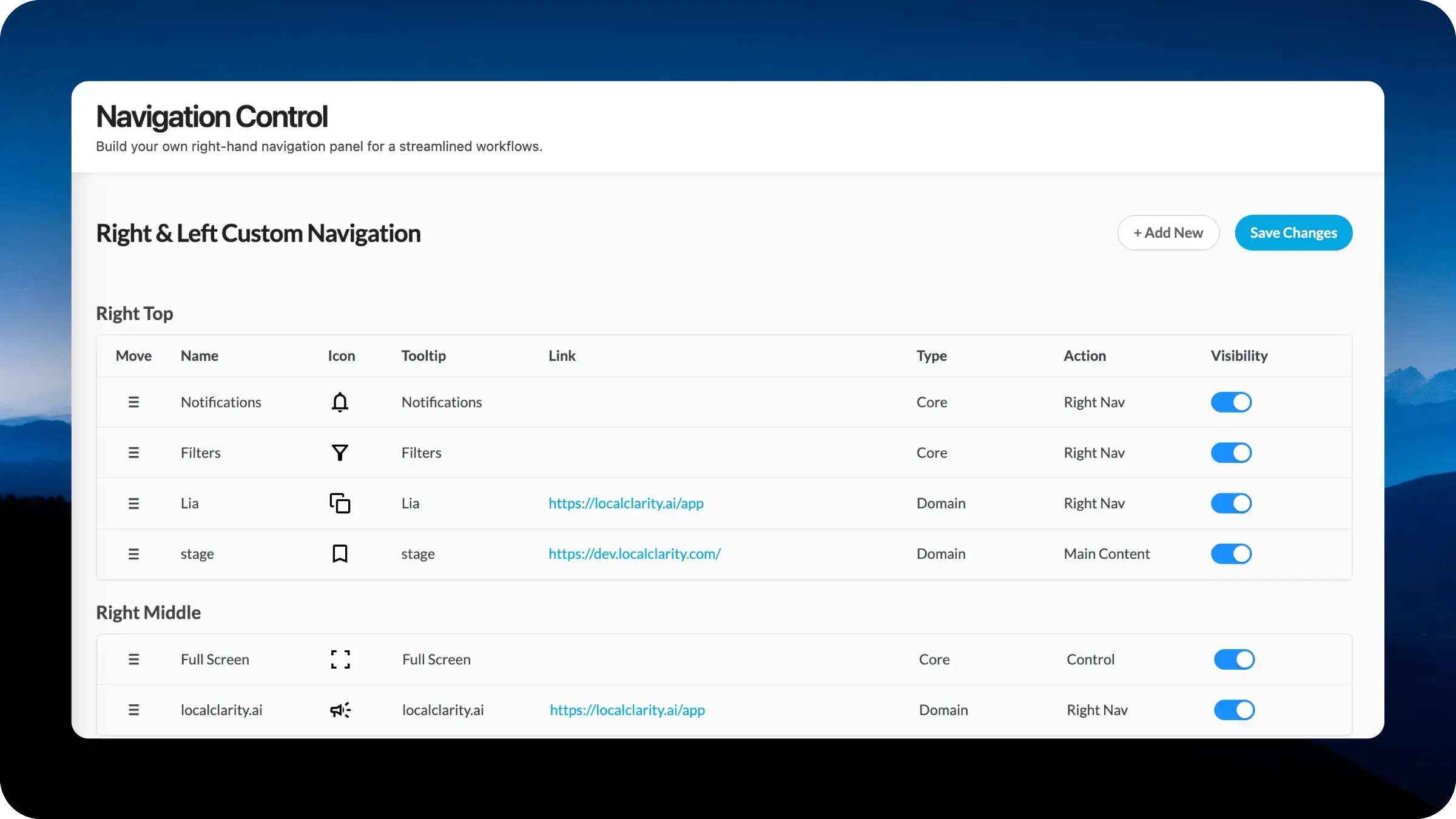
Navigation Control lets you build the content of the new right-hand navigation panel by adding, reordering, and styling the links your team actually uses. Configure name, icon, tooltip, destination URL, type, and action behavior for every entry, organized across Right Top, Right Middle, Right Bottom, and Left Bottom zones.
Designing navigation is genuinely hard. Every choice made about which tools deserve a permanent spot in the navigation, and in what order, is a judgment call about what matters most, and that judgment is different for a hospitality enterprise than it is for a regional retailer or a multi-brand agency. Ship a navigation that leans toward power users and casual users feel overwhelmed. Ship one that leans simple and the teams who live in the platform all day lose quick access to the tools they reach for constantly.
We have made our best calls on those defaults over the years, but the better answer is to hand the decision to you. Navigation Control lets each brand resolve those tradeoffs for itself, surfacing the tools and resources that match how your team actually works.
Open Settings and select Navigation Control to access the new composer. The right navigation is now divided into four placement zones: Right Top for primary tools, Right Middle for utility controls, Right Bottom for support and reference resources, and Left Bottom for low-frequency items pinned to the opposite rail. Drag-and-drop reordering works within and across zones.
For every entry, you control seven dimensions:
The Add New button creates custom entries from scratch, and Save Changes commits the configuration to the live navigation immediately.
Navigation Control is part of the same LocalClarity2.0 principle behind the Filter Composer: shape the platform around how your team works, not the other way around. The sections that get used most should be the ones you have the most control over.


